About the Brand
I collaborated with MedVoyage, a Mumbai-based facilitator of cross-border healthcare.
Their homepage headline, “Your Trusted Partner for Medical Travel to India,” sums up the brand’s promise:
giving African patients a seamless, dignified and supportive path to advanced treatment in India.
The challenges
In a saturated market, every scroll is a blur of look-alike logos and interchangeable promises; attention lasts milliseconds.
To rise above that noise, a brand needs a visual hook that arrests the eye, a colour story that’s unmistakably its own, and messaging that speaks to one clear human benefit—fast.
Distinctiveness isn’t decoration; it’s how you earn the pause, the click, and ultimately the trust.
our solution
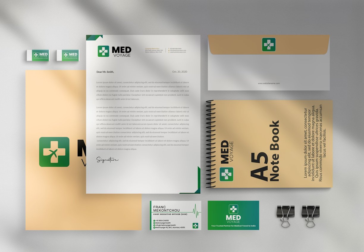
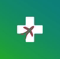
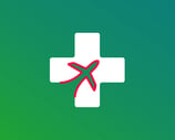
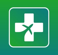
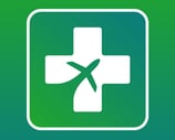
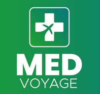
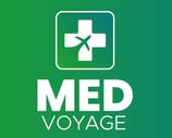
We carved an aircraft silhouette into a medical cross, creating a one-glance story of “care + travel” unlike any rival symbol.
Ownable gradient – A proprietary emerald-to-teal blend becomes MedVoyage’s fingerprint across every touch-point, cutting through the wall of flat blues and reds.
Heavy, geometric “MED” is balanced by lighter “VOYAGE” giving the wordmark clarity and harmony.
Minimalist system – Airy layouts, generous white space and a tight colour palette keep collateral clean, premium and instantly recognisable.


Colors
Emerald ➜ Teal gradient
A diagonal sweep from fresh emerald green (#26B14E) to confident ocean-teal (#007C8A) mirrors the patient journey: starting with hope for healing and arriving at trusted, world-class care.Symbolism
Green cues vitality, growth, and recovery. Teal adds calm authority and professionalism. Together they balance empathy with clinical credibility.Utility
On screens the gradient gives depth; in print the solids can be split for clear hierarchy. Paired with clean white it keeps interfaces bright, accessible, and unmistakably MedVoyage.


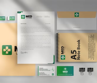
Brand collateral