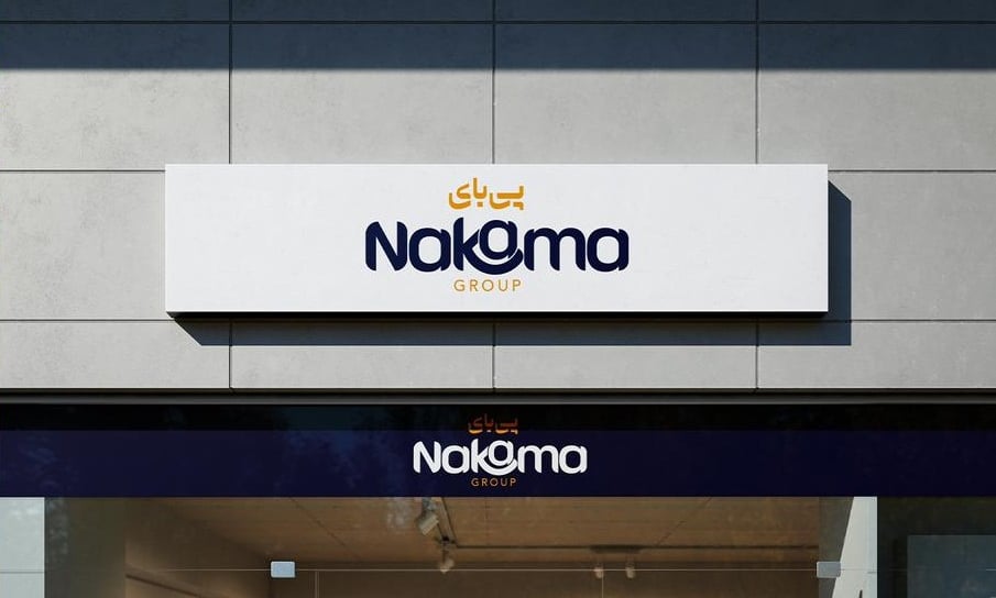
About the brand
Nakama is a Dubai-based company with a focus on celebrating and sharing Middle Eastern culture through diverse ventures.
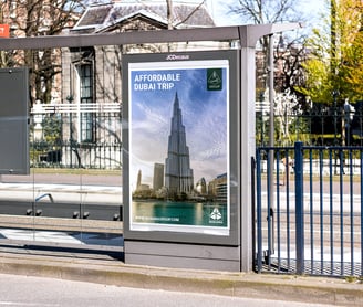
With plans to operate across three main sectors—Arabic-inspired perfumes, a travel agency, and food export—Nakama aims to become a multifaceted brand that connects global audiences to the richness of the region's traditions and flavors.
The Challenge
The visual identity lacked the sophistication needed to establish Nakama as a credible and professional company.
There was no cohesive brand strategy to connect the diverse sectors under one unified identity.
A consistent style guide was needed to ensure uniformity across all materials and touchpoints.
The visual identity was too friendly, which didn't communicate professionalism.
Our Solution


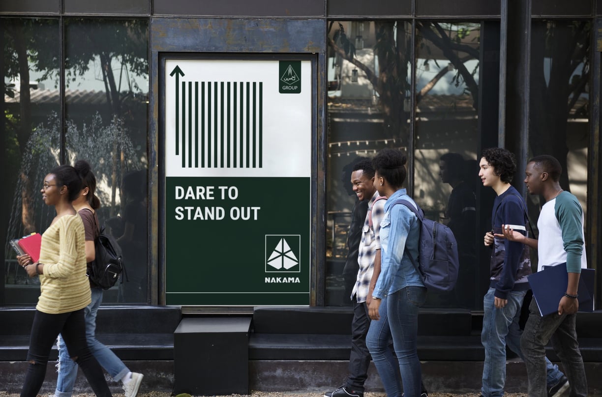
Geometric Symmetry: The triangular shape with divided sections conveys precision, balance, and professionalism.
Pyramid-like Shape: The triangular form suggests growth, strength, and stability—qualities often associated with successful businesses.
Bold Typography: The all-caps, sans-serif font for "NAKAMA" adds a modern and confident look.
Minimalist Style: The use of simple shapes and a monochromatic scheme ensures versatility and a timeless corporate feel.


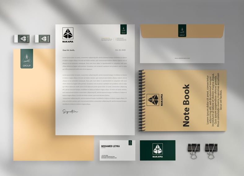
This logo for Nakama features a geometric design resembling a triangular or pyramidal structure divided into symmetrical segments, creating a dynamic and structured appearance. Below the emblem, the company name "NAKAMA" is presented in bold, uppercase typography.
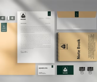
Branding Collateral